
Typography is not only about choosing a pleasant font; it is the art of making the text readable, attractive, and harmonious. Leading is one of the most significant concepts of this art form. But what then is it, and why?
What is Leading in Typography?
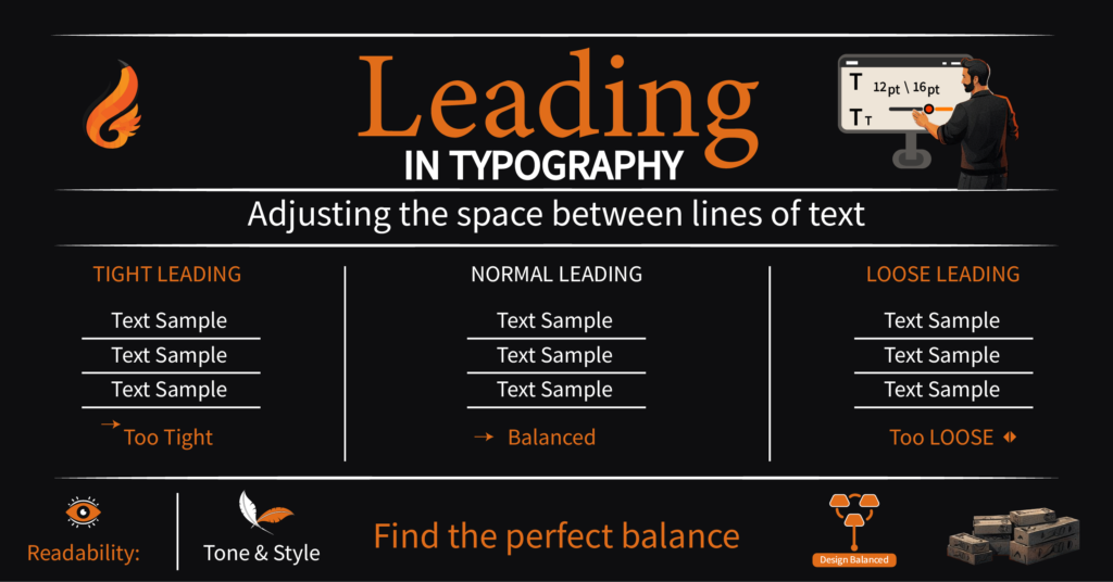
Leading in typography (dasher in the US) refers to the distance between lines of text. The term is a remnant of the olden days of the traditional printing presses, when strips of lead were literally inserted between the type lines to provide spacing. In modern digital design and publishing, it has been adapted to software, but the principle is the same: this has an effect on readability, tone, and the general design aesthetics.Why Leading Matters
Readability Excessively small fonts give the text a crammed and overwhelming appearance. An excess of it makes it look unrelated and untraceable. The right balance enhances the reading. Tone & Personality Close leading is full of urgency and intensity. Openness, breathing space, elegance, all of these are communicated by generous leading. Hierarchy & Design Balance Leading is used to create a visual rhythm and to make your text flow smoothly with the other design elements, such as images, headlines, and whitespace.How Leading is Measured
The points are usually used to measure the leading. For example: When it is 12pt, and the leading is 12pt, the lines will overlap, and there will not be any additional space. You have 12pt and 16pt leading – you have 4pt of blank vertical space between each line, thus the text has more room to breathe. The majority of designers use a dominant value of 120-140 percent of font size as the best reading font.Leading in Action
|human|>Leading in Action Tight Leading: Ideal when there is limited space, and you have to use it, and the text is brief. Normal Leading: Applied to text in books, blogs, and websites–balances legibility with economy. Loose Leading: Works well with a luxury brand, magazine, or a design that requires lightness and elegance.Common Mistakes in Leading
Too Tight – Makes text passages difficult to read, cloggy. Too Loose – Interferes with the smoothness of the flow and it is hard to tie the lines into a paragraph. Uneven Leading – Indiscriminate use of varying spacing is visually disastrous.Best Practices in the design.
Use 120-140 percent of font size as a starting point. Modify font style (serif, sans-serif, script, etc.). Think about the medium: print has a much lower leading requirement whereas digital screens have a more relaxed leading requirement. Do not use Lorem Ipsum, but use actual text so that you can see how your visitors will actually read it.Being a Design Superpower.
Typography is detailed all the way, and leading is one of the greatest tools of your design kit. Spacing between words in a right line can turn an undecipherable mess into a work of a stream of well-written stories.The practice of leading in typography is essential, in case you want your words not only seen, but also felt.
Limited Time Offer
$199
Website + Branding Bundle
- 3 Page Website
- 4 Logo Concept
- Source Files
- Responsive Website
- Business Card Design
- Social Media Icon
- Facebook Banner
- Free Domain Included